When it comes to brand, consistency is key. A consistent application helps build brand recognition. When we engage with any new client, one of our first requests will always be for your brand guide. It is always surprising when a client does not have one.
How do you achieve brand consistency when a designer/agency has only provided a logo? How do you decide what fonts or colours to use? During the branding process, which could be for a new brand or a rebrand, any good designer should provide their client with a set of brand guidelines. This may be a simple or very extensive guide, depending on the unique needs of your brand, but includes a set of rules that dictate how brand elements are to be applied, such as logos, colours, fonts, and various other elements.
By following the guidelines, other agencies/designers/vendors or even internal members of your team should be able to effectively apply your brand without the original designer’s direct input. A well thought out brand guide will allow for flexibility to make allowance for creativity within a set application of rules. A brand that is too limiting can easily become dull without room for exploration and growth. A brand without any guidelines results in inconsistent results. To ensure the longevity of your brand, please request a brand guide for any new or rebrand.
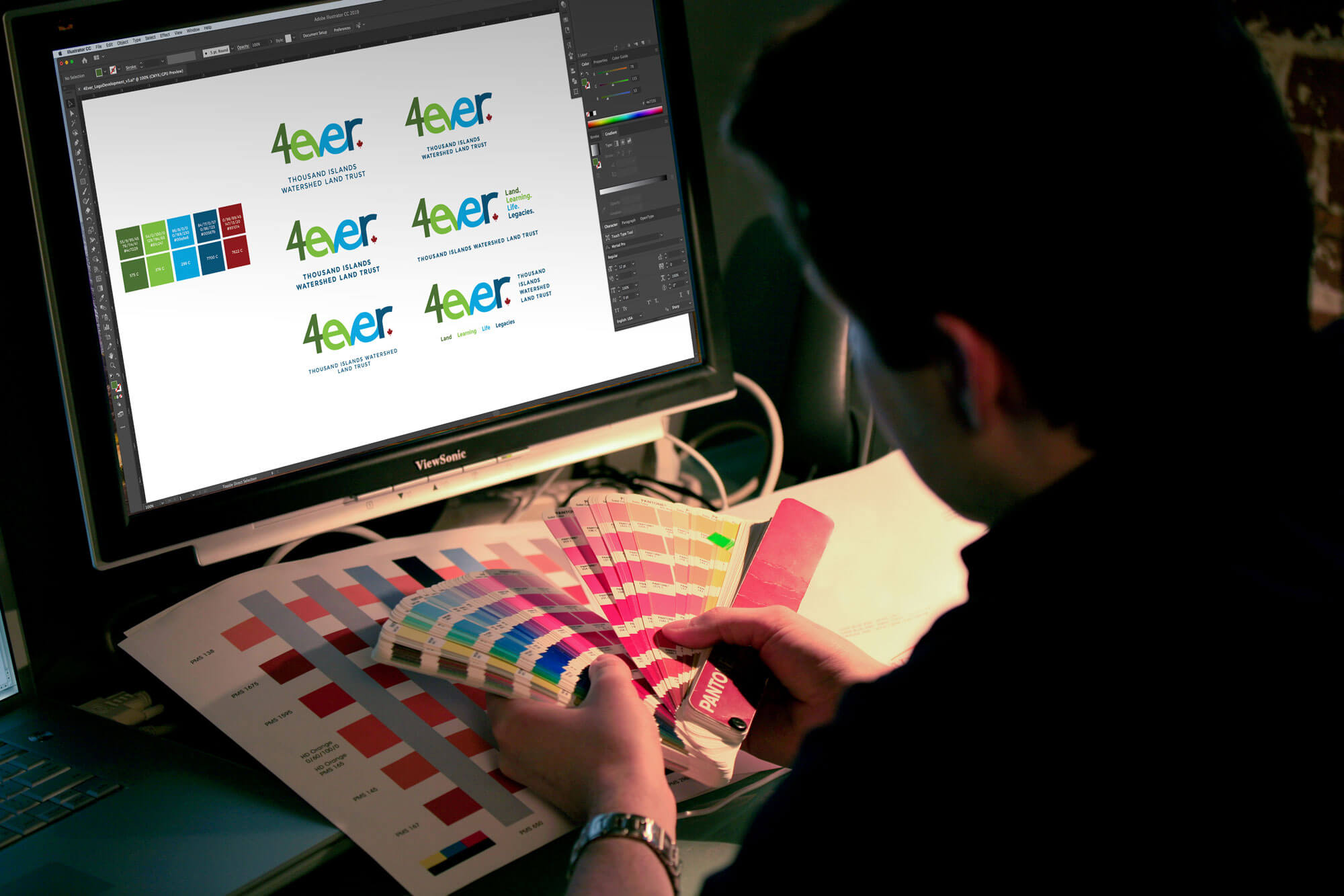
Now, lets break down some of the main elements you can expect to find in a brand guideline. Examples shown are from our recent rebranding of Thousand Islands Watershed Land Trust.
Logos
Many brands have multiple versions of the logo. Sometimes there are vertical and horizontal formats, sometimes they do and do not include a tagline and very often there are multiple colour versions available. The reason designers like to provide multiple versions of a logo is to ensure the brand can be effectively utilized across many applications. For example, if you have a very long horizontal logo and a tall skinny area to place it in, the logo would have to be very small to fit, which wouldn’t be great for your brand. Therefore, by providing a vertical version, the logo can appear much larger and be more visible, improving brand recognition. Your brand guidelines should outline all the versions of the logo and explain when and how to apply each effectively.
Colours
For highly recognizable brands, certain colours may come to mind, such as Coca-Cola red or Ikea’s blue and yellow. These colours stand out because they have been consistently applied for many years. Fortunately, many brand guidelines will include the particular colour palette(s) for your brand. They will include the exact colour values to use in both print (Pantone or CMYK) and web/screen applications (RGB or HEX), and it is important to use those exact colours for consistency. Could you imagine seeing Coca-Cola in blue? With a simple change in colour, even a subtle one, the brand conveys an entirely different feeling. This demonstrates how important brand colour really is.

Fonts/Typefaces
Just like colour, a consistent use of font is important for your brand. Designers strategically select typefaces to match your brand personality and some will even specify certain font weights. Your brand guidelines will outline what typefaces to use and even include substitutes in case certain typefaces are not available. When you inadvertently chose a font, you change your brand personality and may even unintentionally impact legibility.

Other
With each brand comes a unique set of needs. Through research and your input, a designer will learn what your unique needs are and be able to establish a unique set of brand elements and rules for their application. Your guidelines should provide you with many tools to implement for every branded application. Don’t be afraid to utilize what makes you stand out.
It is important that you or a dedicated member of your team thoroughly read and understand your brand guidelines. It is up to you to ensure that anyone working with your brand applies it effectively. If you don’t enforce consistent brand application, you may as well kiss your brand recognition goodbye. As always, if there are any questions, reach out to the original designer for clarification.